
Revolution Cannabis
I joined Revolution Cannabis in mid-2015. At that time the Illinois Medical Cannabis market had not even began retail sales. The rules for creating a cannabis brand in a legal market were unclear. The industry itself was just beginning to emerge from shadow of decades of illegality.
Joining the industry at that time was one of the most exciting moments in my career.
Client: Revolution Cannabis
Role: Senior Designer, Art Director
Software used: Photoshop, Illustrator
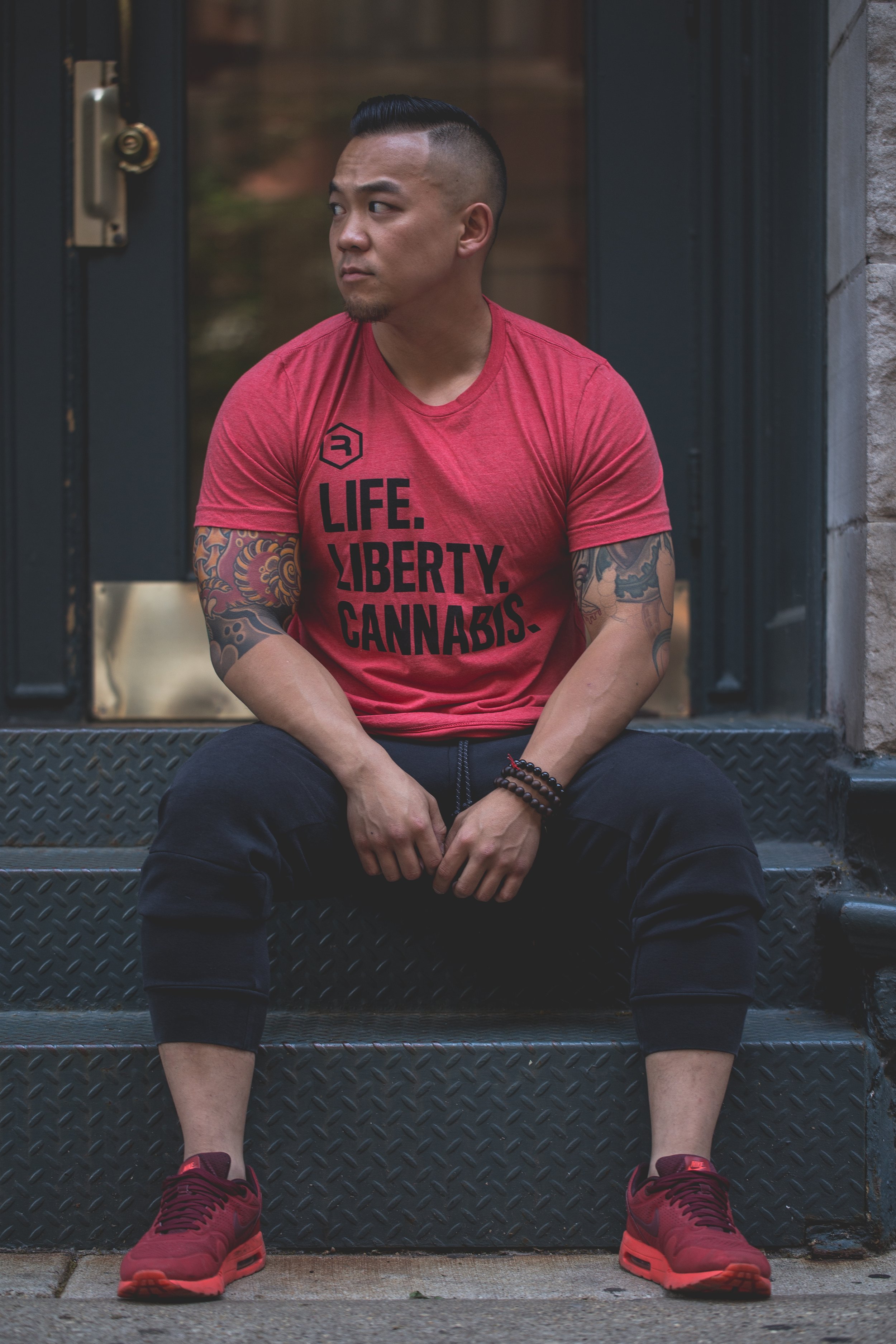
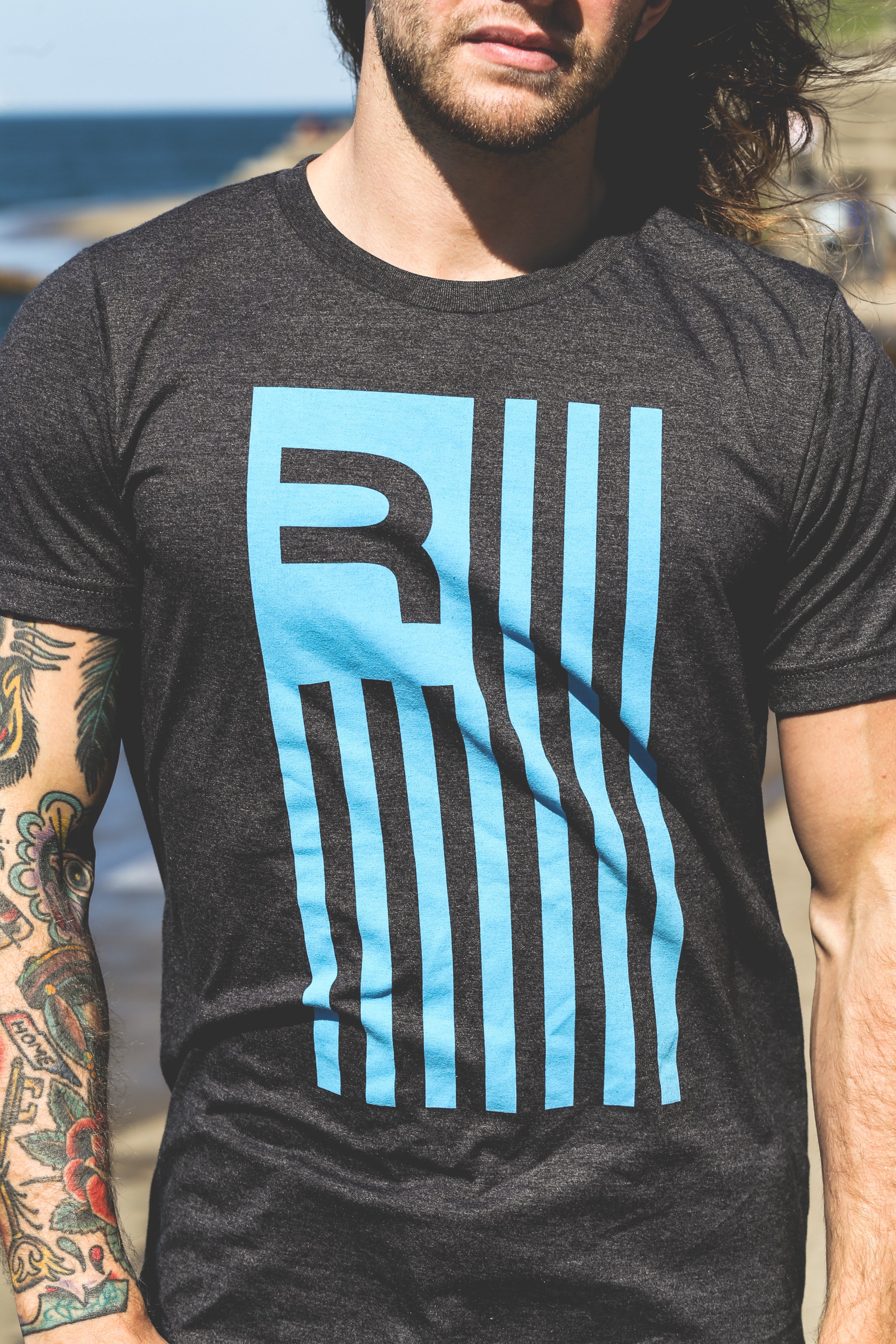
Apparel photography by Tommie Nguyen (@sifusohi)


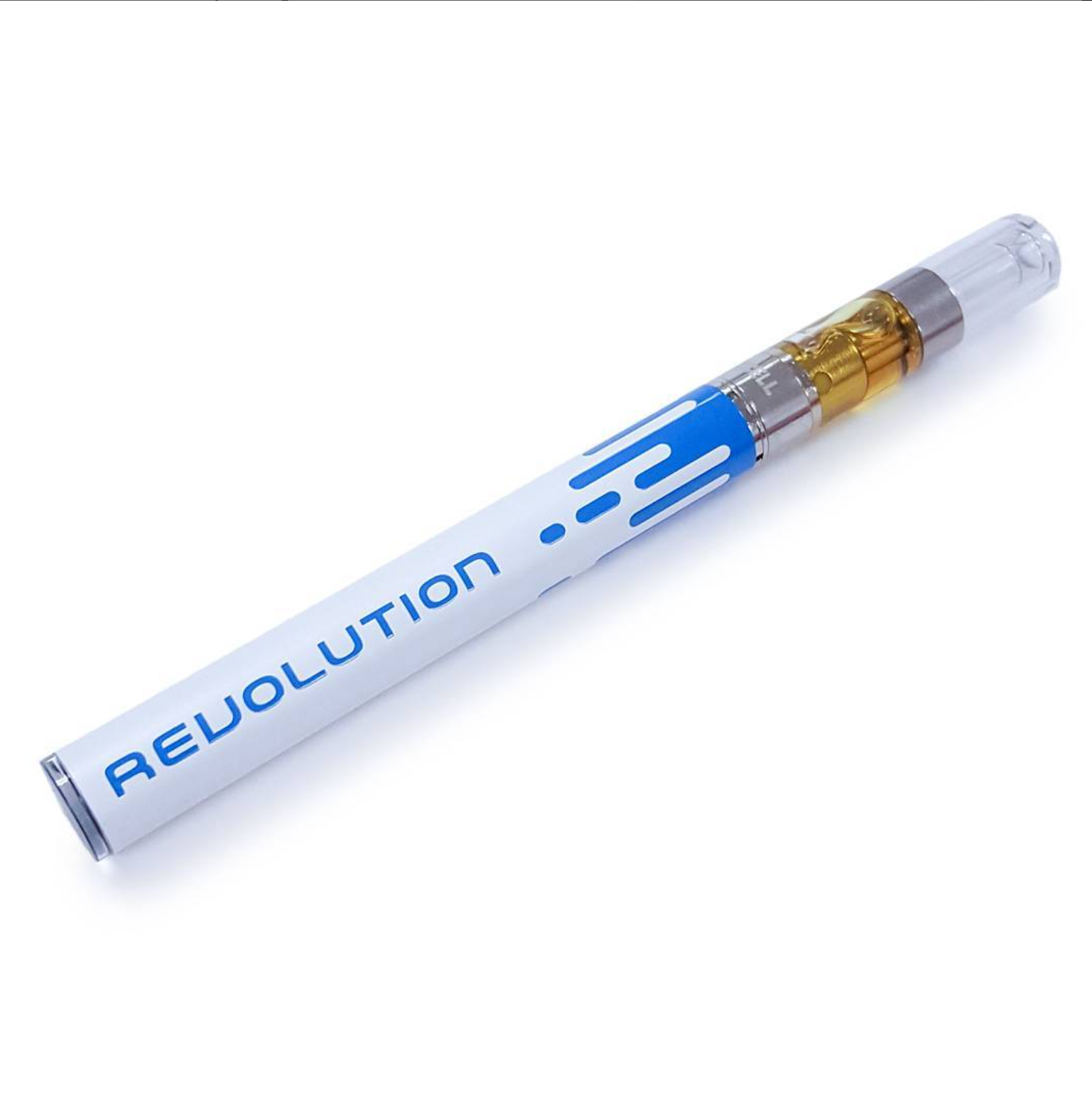
Cannabis Packaging Design
The options for cannabis packaging in 2015 were extremely limited to just a few suppliers. So much of what appeared on dispensary shelves utilized the same child-proof containers. This definitely created a unique creative challenge for how to stand out!
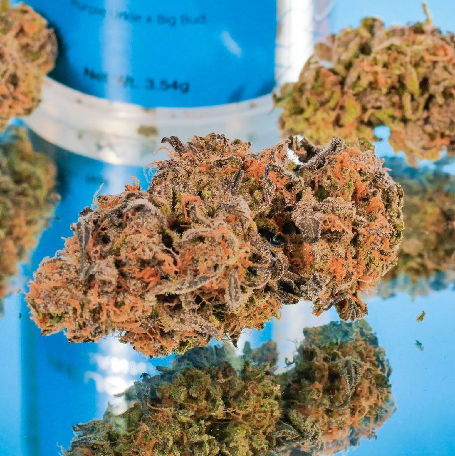
Top: This is a shot of the very first iteration of cannabis flower packaging from Revolution. State regulations prevented us from showing the actual product so patients were playing a guessing game when walking into a dispensary. Our goal was to provide IL medical cannabis patients with as much information as possible on the outer packaging.
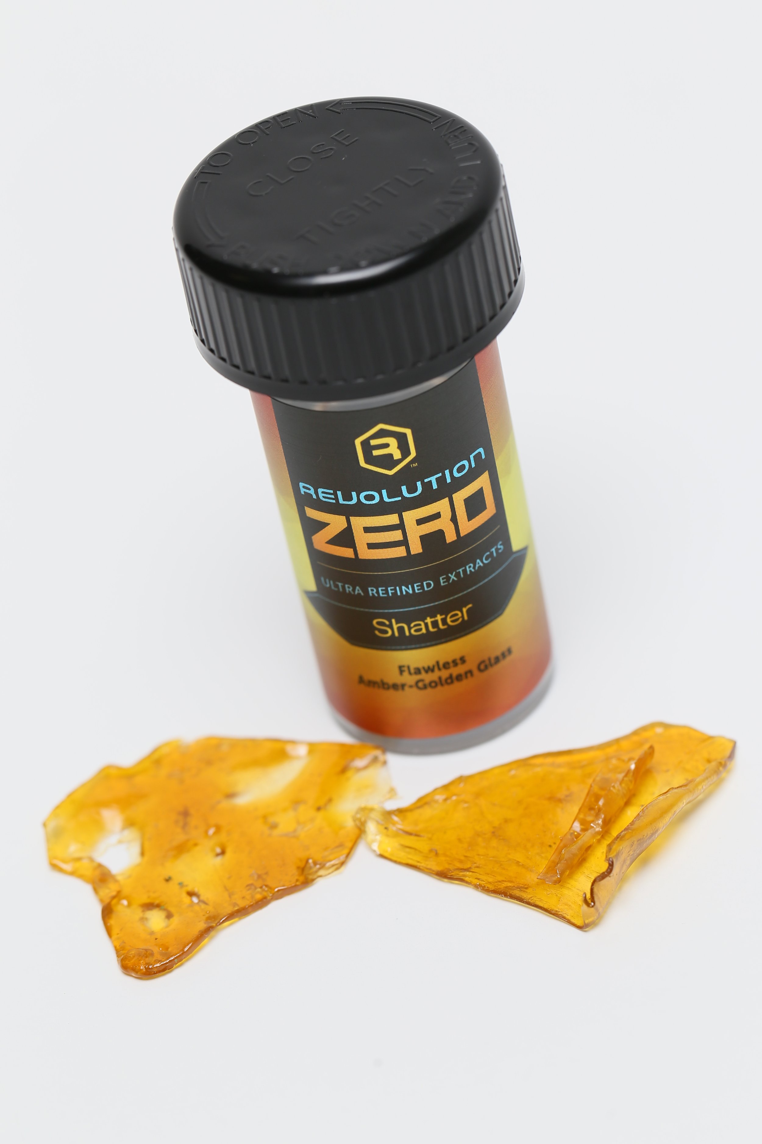
Middle: The brilliant Revolution lab team created a small line of solvent-free extracts - something not many in the IL market were doing at that time. The idea behind this look was to communicate to the patients that these products were made by natural processes using no chemicals.
Bottom: Surp was the first product under the Spring Lake Infusions brand for Revolution. Surp is a sweet infused syrup that patients can add to their drinks. Perfect for patients that prefer not to smoke or vape. The product was a huge hit in the IL market and has expanded to a coffee syrup line as well.
Life. Liberty. Cananbis.
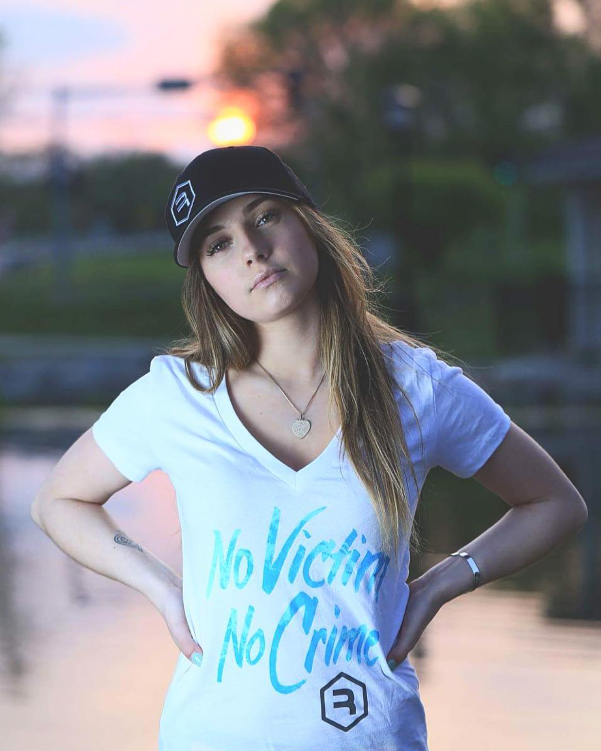
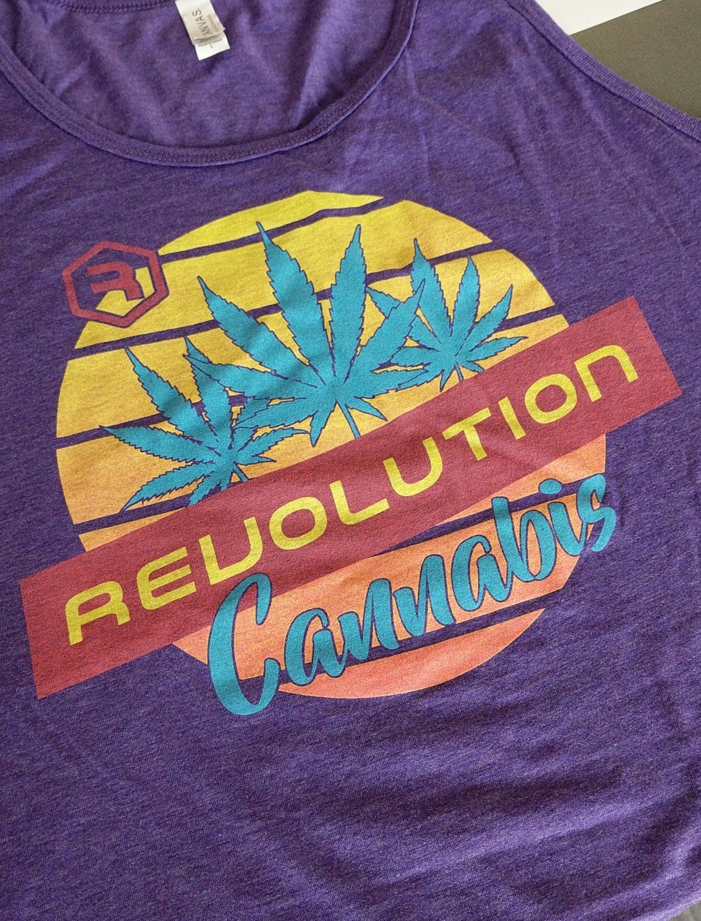
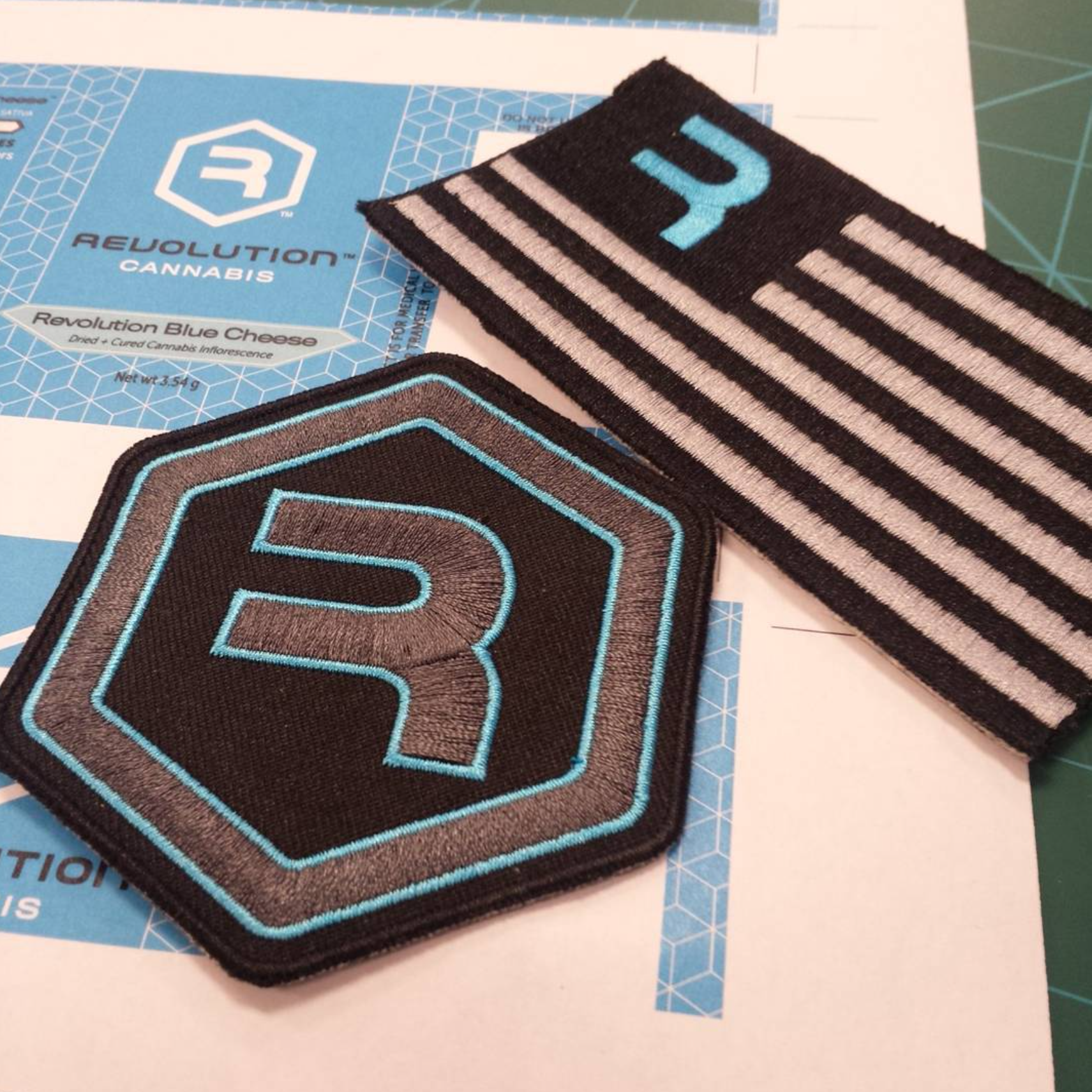
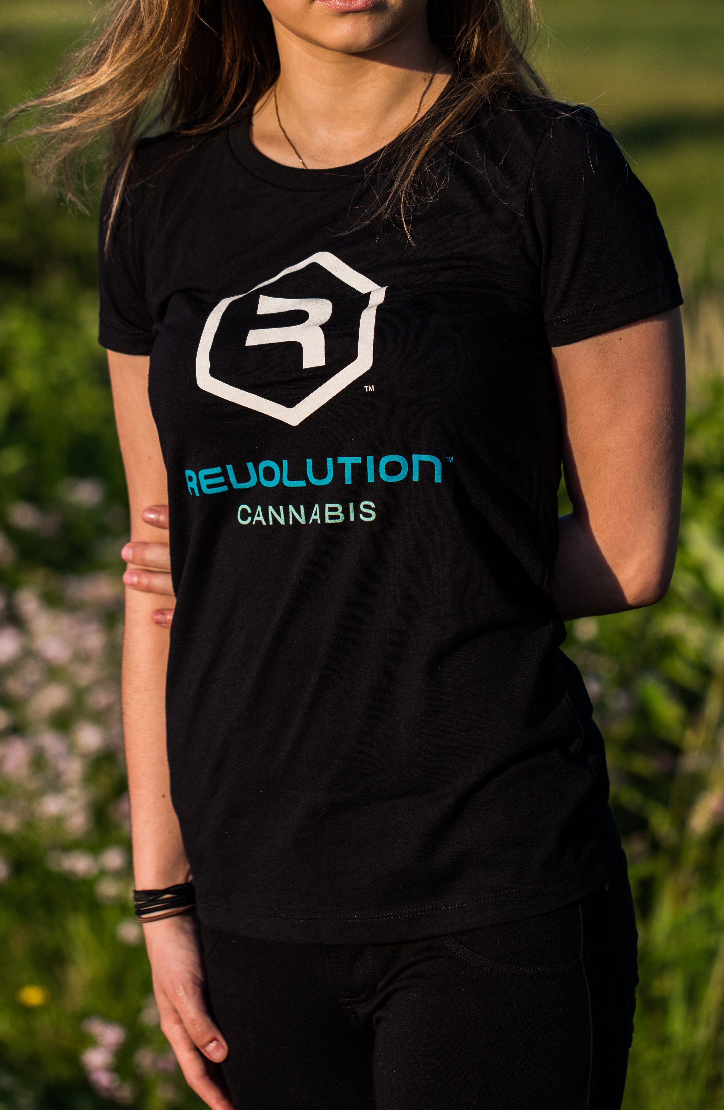
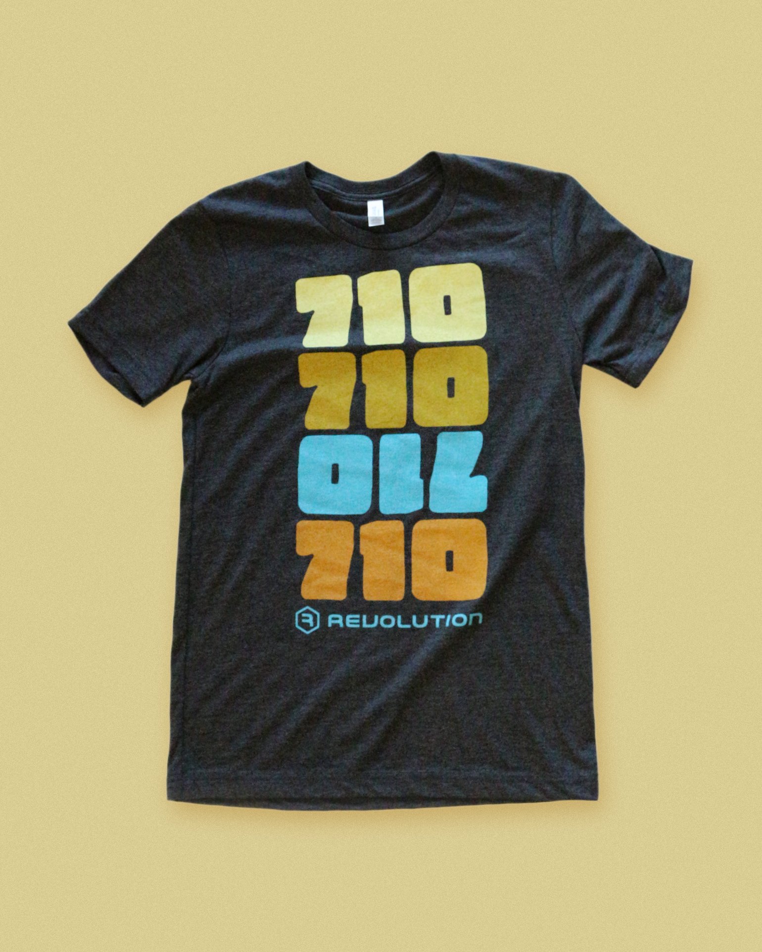
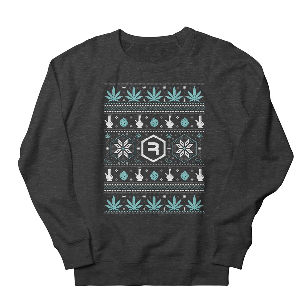
Below are several more examples of product packaging and apparel that I designed during my time at Revolution Cannabis.