
Aleman Brewing Branding and Labels
At the time they came to me for help, Aleman was still just an idea. The guys were still working on getting their brewery space. But they were committed. They had a vision. They just needed my help to bring it to life.
I love being able to help small business owners bring their ideas to fruition.
Client: Aleman Brewing
Role: Art Director, Designer
Software used: Adobe Illustrator, Photoshop
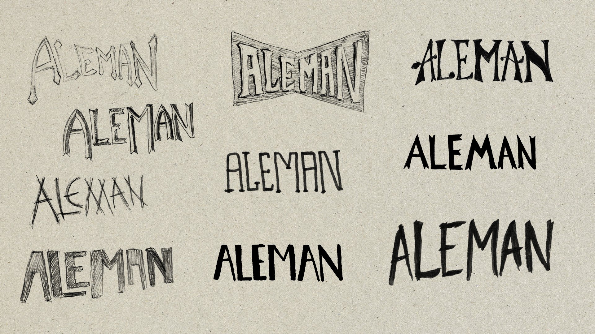
The Logo
The team behind Aleman had a very clear vision for their logo. They had some of their own napkin doodles but need me to refine it and make it real.
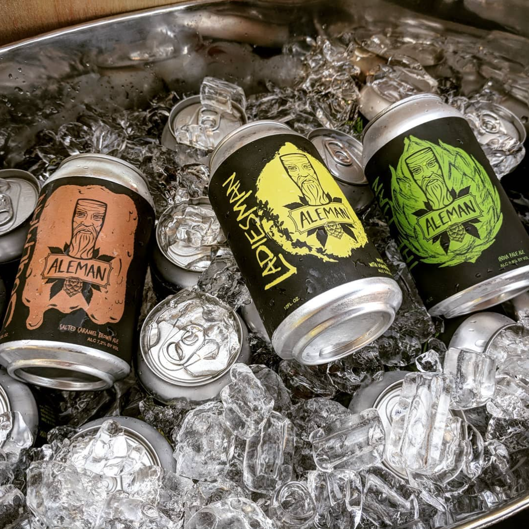
The vision for the brand was to have the Aleman become an iconic character that appears on every can and lovingly-hand-carved tap handle.
The Cans
With the massive popularity of craft beer, it’s hard to stand out on the shelves these days. To keep from fading into the liquor store wall-of-beer we went with high contrast, bright colors and a large icon that represents each unique brew. And of course, making sure Aleman himself was out front and staring you in the face as you browse for that perfect beer.


In the real world
It’s always exciting when your creative ideas get turned into a real object that you can hold. It’s especially fun when you get drink it.
Since launching in Chicago; Aleman stands out as a well respected and successful craft brewery in a very competitive market filled with industry giants.

The Process
Here’s a little peak at some of the typeface sketches and the background graphics used on the can labels.